
Crafting a Progressive Web App for Goalify
Project Overview
Goalify is a productivity app designed to help full-time professionals aged 25–40 manage their time efficiently without feeling overwhelmed. As the UX designer, I collaborated closely with developers and product managers to create an intuitive interface that emphasizes simplicity, goal tracking, and user motivation. Through user research, usability testing, and iterative design, we developed features such as calendar integration, reminders, and progress streaks to encourage consistent productivity habits. Goalify empowers users to stay on track with their goals while maintaining balance and clarity in their daily routines.
Role: UX/UI Designer
Duration: August 2024 to October 2024 (2 months)
Tools: Figma
Discover
Research
Goal
The team wanted to understand how people managed their time and tasks to discover opportunities for a new productivity tool.
Objectives
Discover habits and common issues with time management
Determine the daily routines of participants
Learn what drives productivity for the participants
Methods
Competitor Analysis
User Interviews
Survey
“What challenges do you face in managing your time effectively?”
“What incentives keep you motivated to manage your time?”
“Tell me about a time when distractions or interruptions derailed your plans?”
Competitor Analysis
Trello is designed for companies to collaborate and track projects, but can also be used for personal projects. Boards and cards are easy to use, but have limited features for more complex tasks.

Notion is a powerful tool that is very customizable across all platforms for all types of audiences. The biggest issues with this platform are a high learning curve and limited offline use.
Google Calendar is great for users focusing on day-to-day scheduling and tasks. It also syncs well with the Google Ecosystem. However, not great for project management.
User Interviews
Logistics
5 Participants
Have been full-time employees for 5+ years
Experienced the shift from remote to back to in-office/hybrid
Noticeable Themes
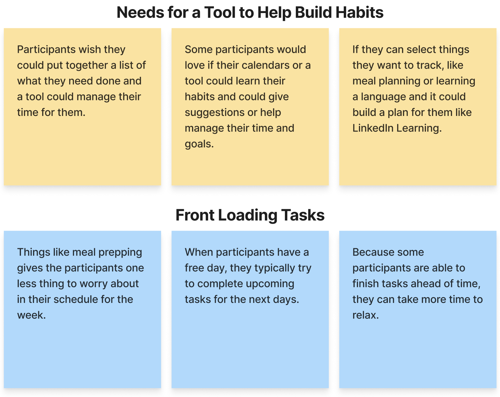
All participants are overwhelmed and would love to have automated reminders and tasks to do.
Multitasking and compounding tasks help with time management. Doing dishes while watching a favorite show. Doing laundry while working remotely.
Participants believe that building better habits may be better than rewards for motivation. Helping people with timing
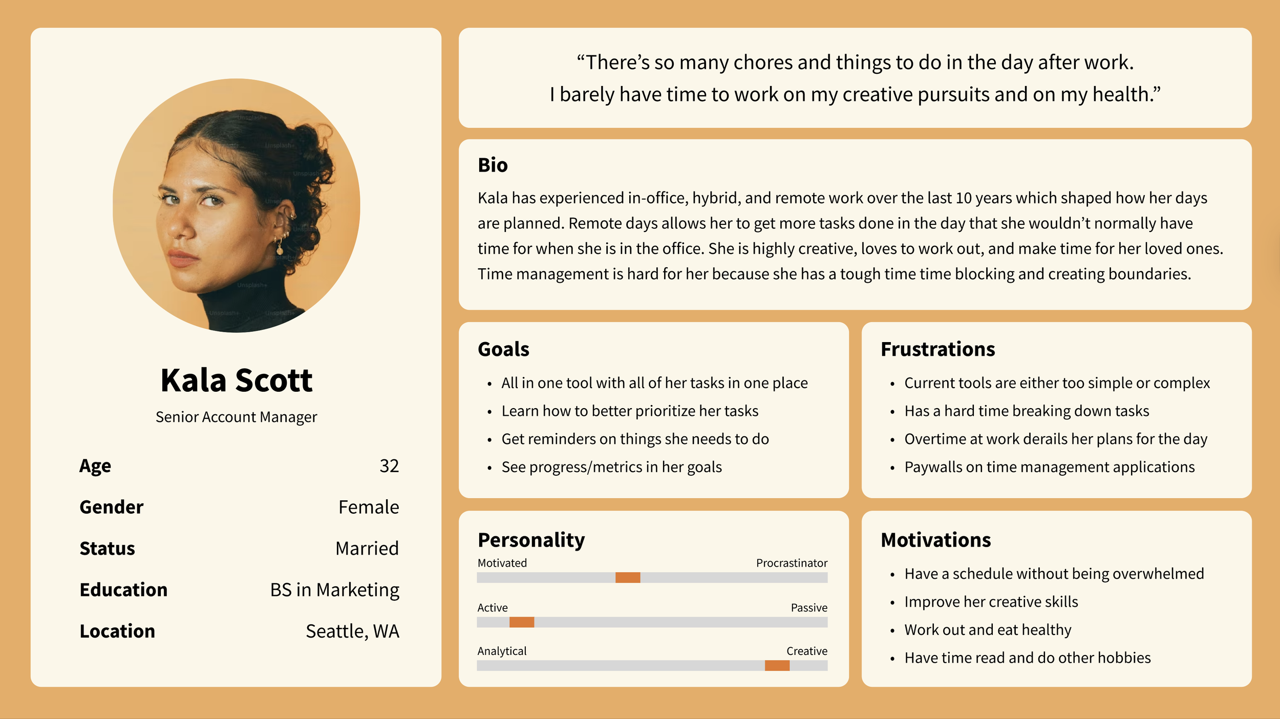
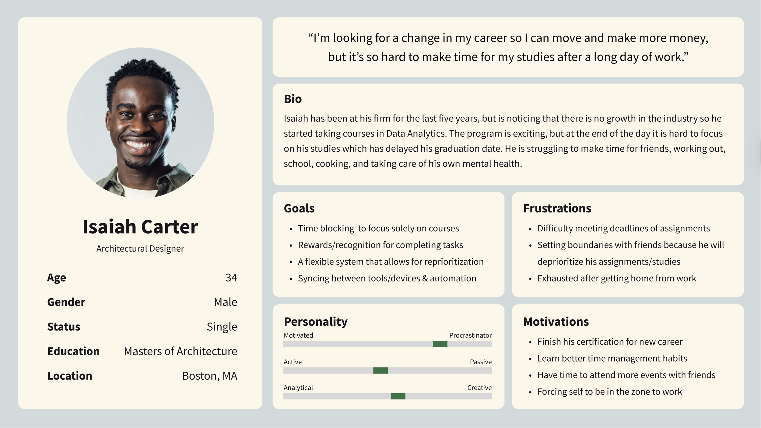
User Personas
There are two general personas we wanted to focus on based on survey results and interviews. While very similar, one persona is typically really busy and overwhelmed, which leads to having a hard time managing their time. The other persona is looking to make time to advance in their life by learning new habits.
Problem Statement
To be a working adult means making time outside of responsibilities. Balancing tasks and achieving personal goals can feel overwhelming, whether it's deciding what to eat, hitting the gym, or pursuing creative outlets. But time management doesn't have to be a struggle.
“How might we design a goal-setting experience that feels fun, rewarding, and keeps users motivated?”
Define
Feature Set
01. To-Do List
A central hub where users track what needs to be done and celebrate their progress. It offers quick access to different dates, with prompts encouraging users to get ahead.
02. Goal Creation/Editing
Setting goals should be simple, not a chore. We’ve made it easy to focus on what matters without over-complicating the process.
03. Calendar
A visual overview helps users see what’s been completed and what’s upcoming, enabling them to reprioritize as needed.
Information Architecture
I performed a card sort to understand the mental model of an average climbers and created the site map seen below. The main focus of the information architecture is for users to log activity for a climb. Climbs and activity logging can be seen in multiple sections of the application.

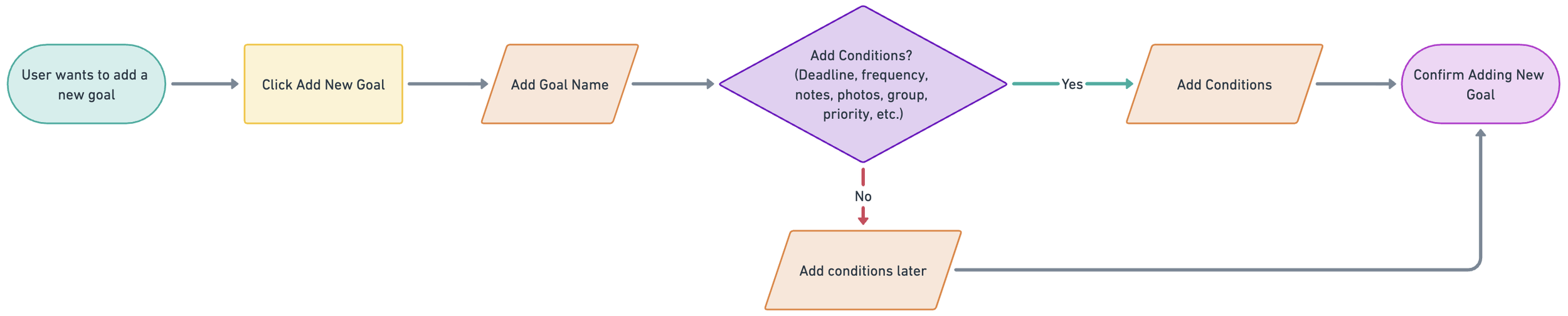
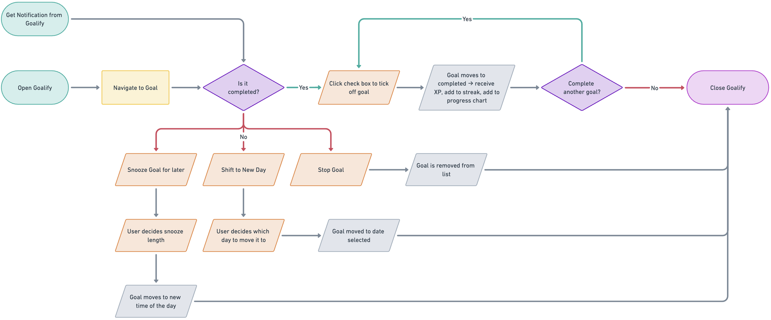
User and Task Flows
While focusing on the most important part of the product, we covered everything from creating to managing tasks.

Brand Identity
Developing the Goalify Brand
The name Goalify combines “goal” and “simplify,” reflecting the product’s mission to make goal-setting more actionable and accessible. The logo was designed to be simple and clear, reinforcing the idea that working toward goals can feel easier.
INITIAL LOGO DESIGN
LOGO REDESIGN
After receiving feedback from user testing, the logo felt sporty, stiff, and cold. To bring back the element of fun and motivation, I redesigned the logo to be more friendly, inviting, and inspire progress.
Design
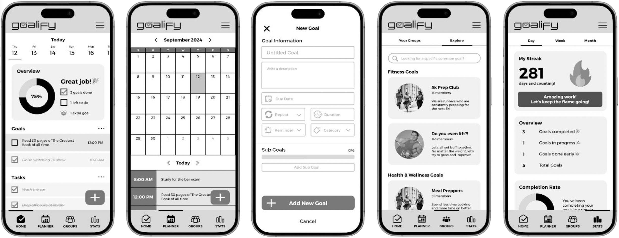
Mid Fidelity Wireframes
During our sessions as a team, we wanted to incorporate groups and statistics to help users have a community and keep track of their progress. We also thought streaks would be a delightful feature for users. Later, we discovered that we should’ve focused on a minimum viable product.
Testing
Changes after Usability Testing
Something our team struggled with during early sketches and mid-fis was honing in on the must-have features of the Goalify. We had a lot of big ideas, but didn’t prioritize how the features would function. So rather than actually testing out these features, we found ourselves constantly asking “well, what would you want to happen here”?
We had to focus on the main tasks for an MVP: creating, editing, and completing goals. Removing the questionable features and simplifying the lists and calendar made it easier for the developers to begin work on the front- and back-end development.
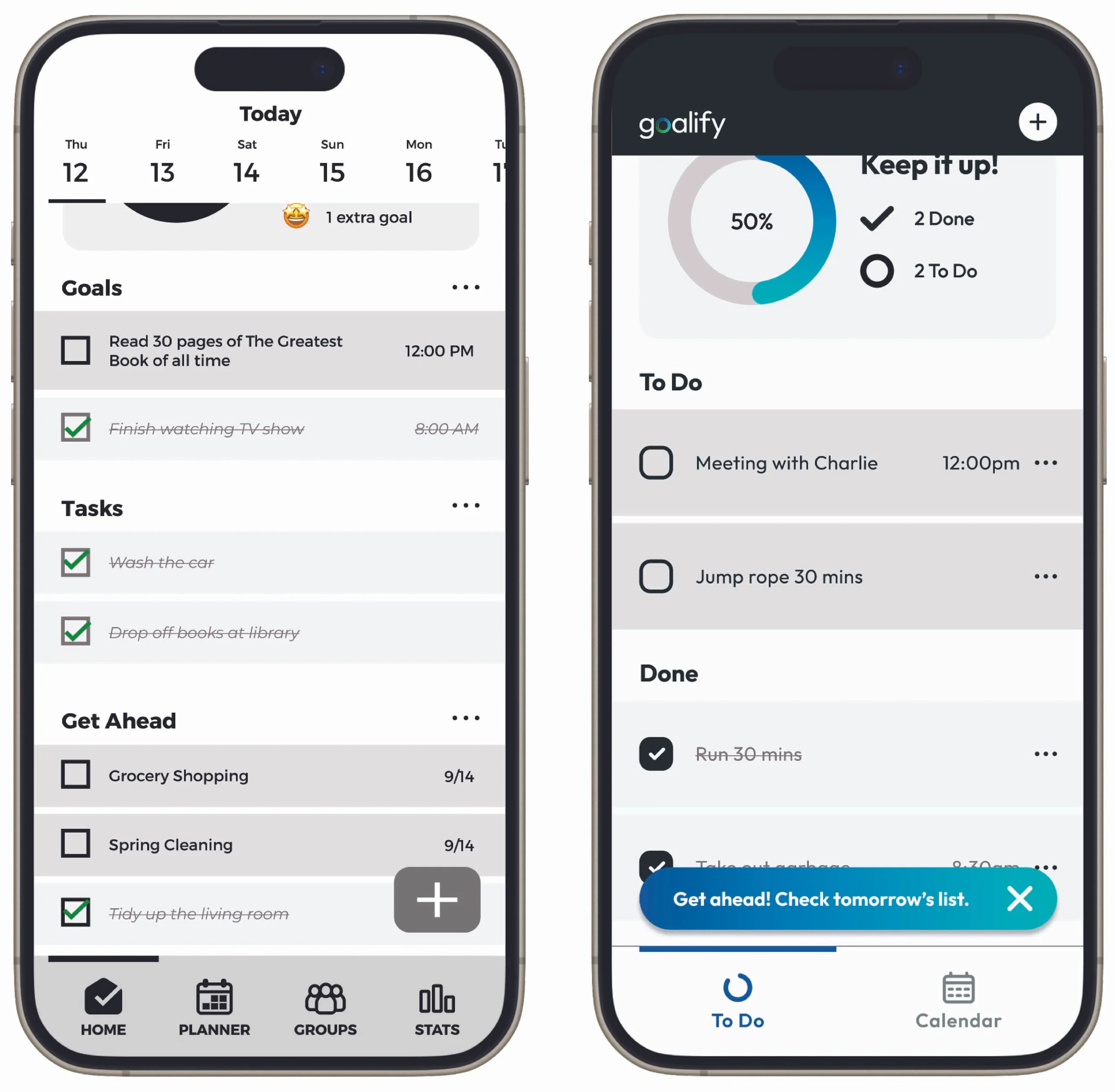
Simplifying Categories
Originally, there were three types of categories: Goals, Tasks, and Get Ahead. This got a little confusing for the users, so we updated it to just To-Do and Done. We also updated “Get Ahead” to be a banner that will take the user to the next day instead of cramming it all on one screen.
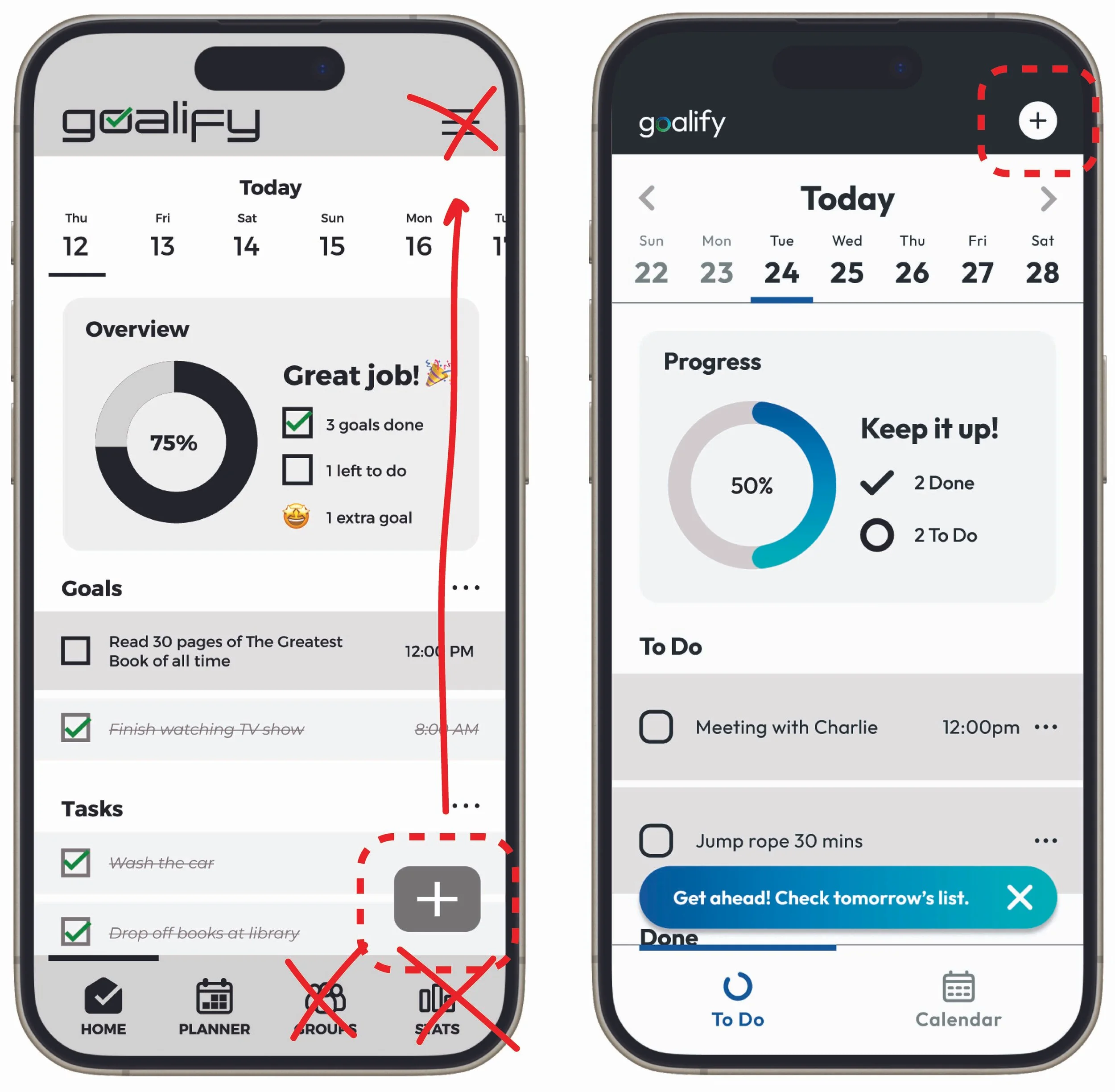
Interface Updates
After removing the groups and streaks feature for the backlog, it gave the designs some breathing room to make some adjustments. The “create new goal” button was moved to the top, since we did not yet fully design a menu anyway. The change of the logo design also guided the rest of the design updates, ultimately making the app more friendly.
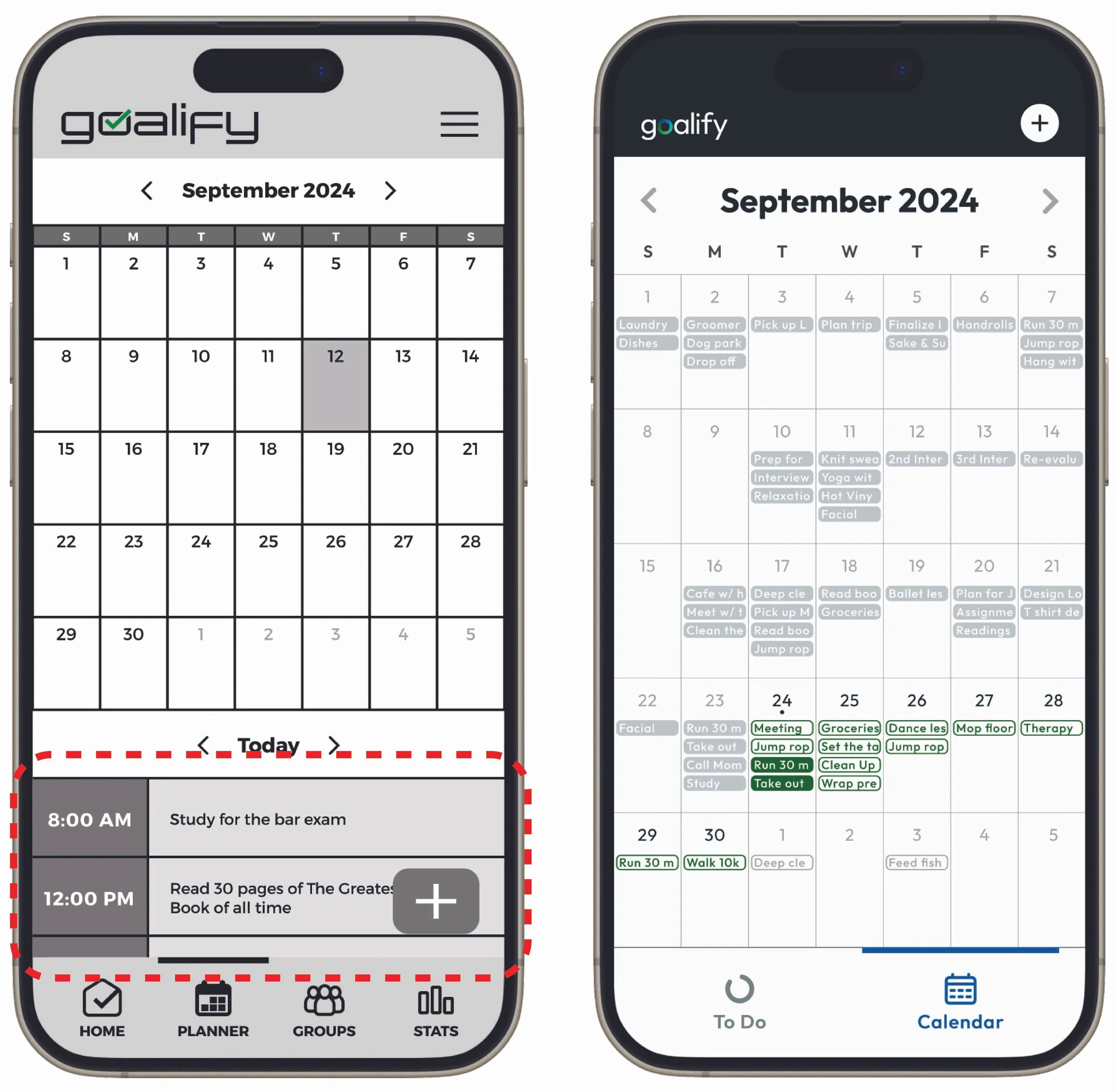
Cleaning up the Calendar
The calendar originally had a way to add a goal as well as review all the tasks for that day, but users were left wondering why it was almost the same as the home page. We took those two features away from the Calendar and kept it simple– more as an overview for the user to map out their month.
Results
Prioritization of Iterations
While we did not get a chance to test the hi-fi screens for this product, I would’ve loved to explore more of how we could help users who are looking to get help with getting stuff done, such as:
Implementing AI to learn the users’ habits and set up suggested schedules
Bringing back a new and more thoughtful version of “Groups” to help users ensure accountability and foster community
Help teach users to build habits, even if it is not the streaks feature

Reflection
Designing a solution for this product helped me learn how to prioritize features for an MVP. The team had so many amazing ideas that the collective forgot to focus on what would matter most to our users within the time and technical constraints.
While sketching the low-fidelity screens, I had many questions about how the groups and stats feature would work in the grand scheme of things. Even after putting together the prototype to perform user testing, I found myself asking participants what they expected from these features rather than having a working and functional feature for users to interact with.
The team ultimately decided to remove the groups and stats features after user testing, which allowed the developers to focus on the core functionality of our product to ship Goalify by our deadline. Overall, I learned that we should definitely focus on the “must-haves” and how they will improve the experience for our users, rather than getting carried away with big features.